
Tinnitus UK: Making Waves
New name with
a double 'N'
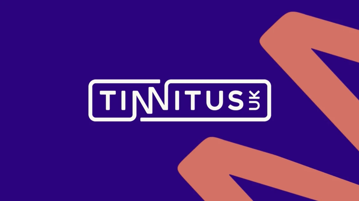
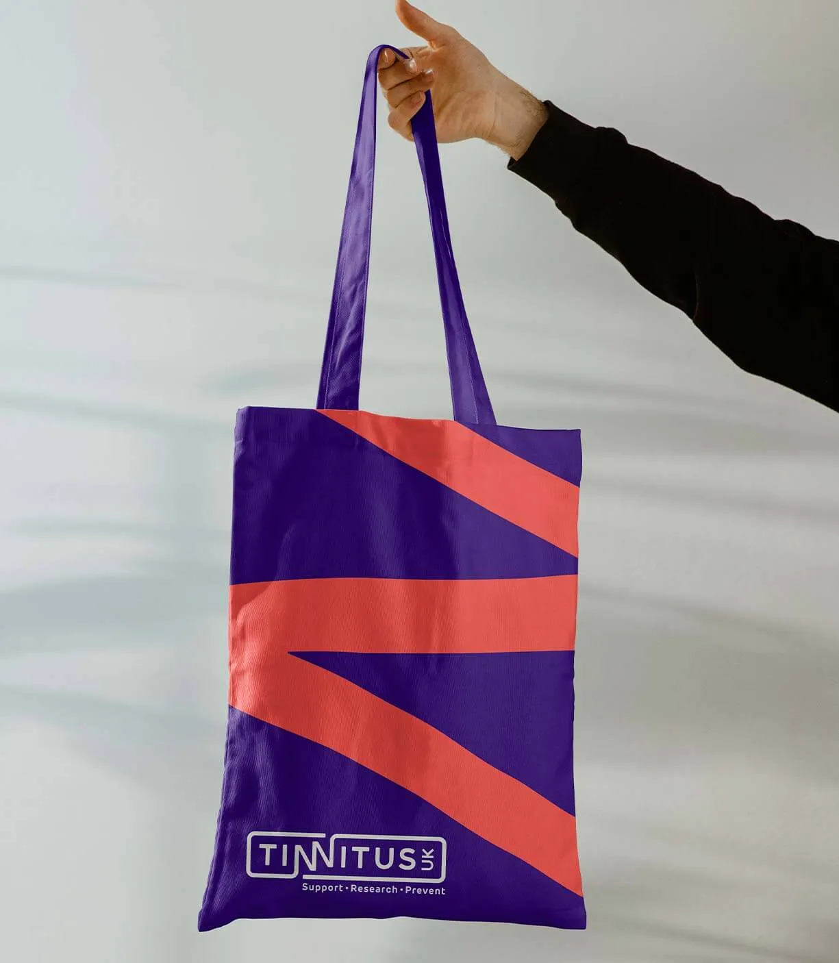
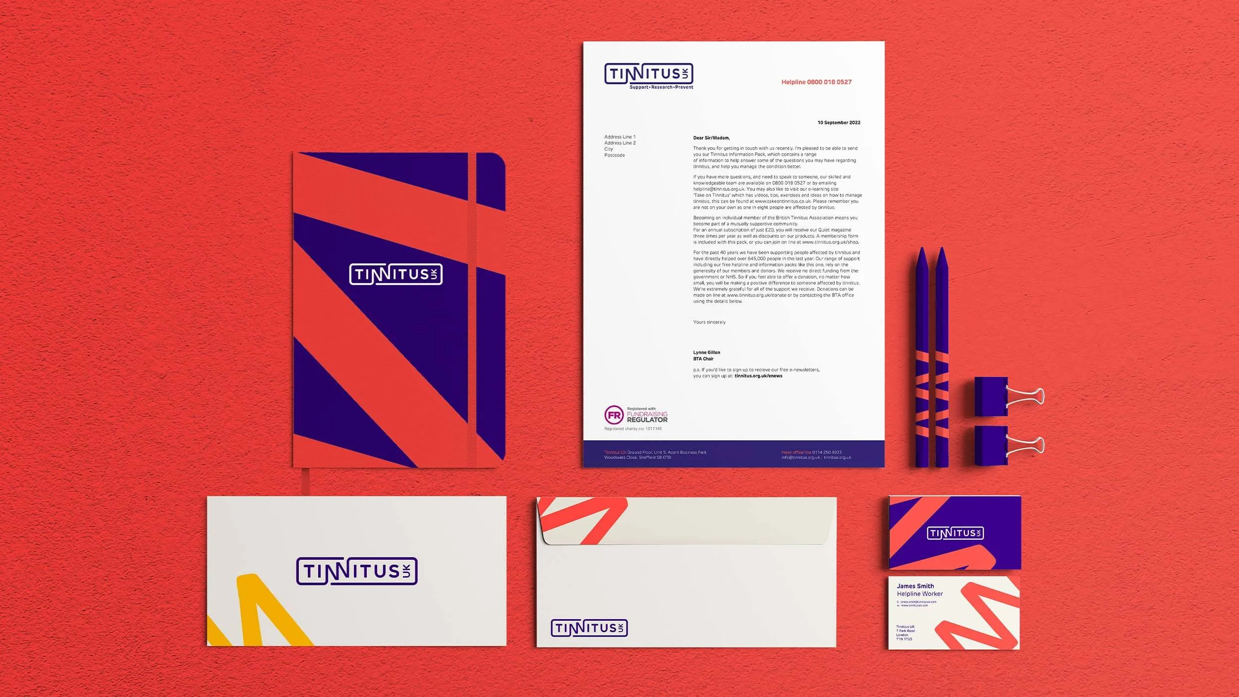
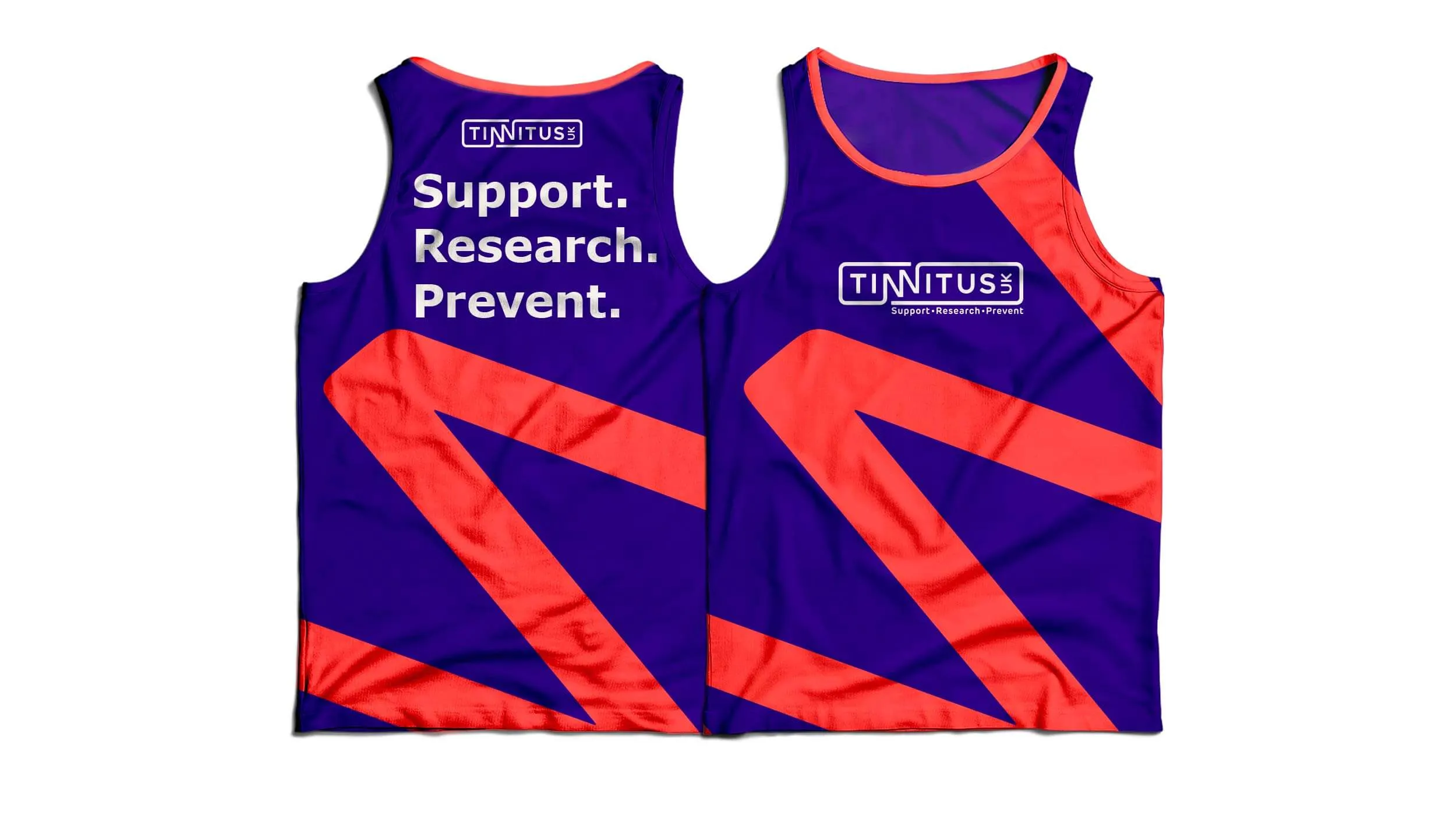
We gave the British Tinnitus Association, the UK’s only tinnitus-focused charity, a new name and look. We dug deep into the organisation and listened to some of the 7.6m people in the UK living with tinnitus. Following some bold strategic recommendations, we overhauled the brand with a new mission and vision, updated the design and changed the name to Tinnitus UK.
The colour palette is accessible for people with visual impairments, and the new identity stands out across digital and social. The logo turns the double ‘N’ into sound waves, disrupting the core to show how tinnitus interrupts unexpected moments. A solid, safe edge represents the relief Tinnitus UK brings.
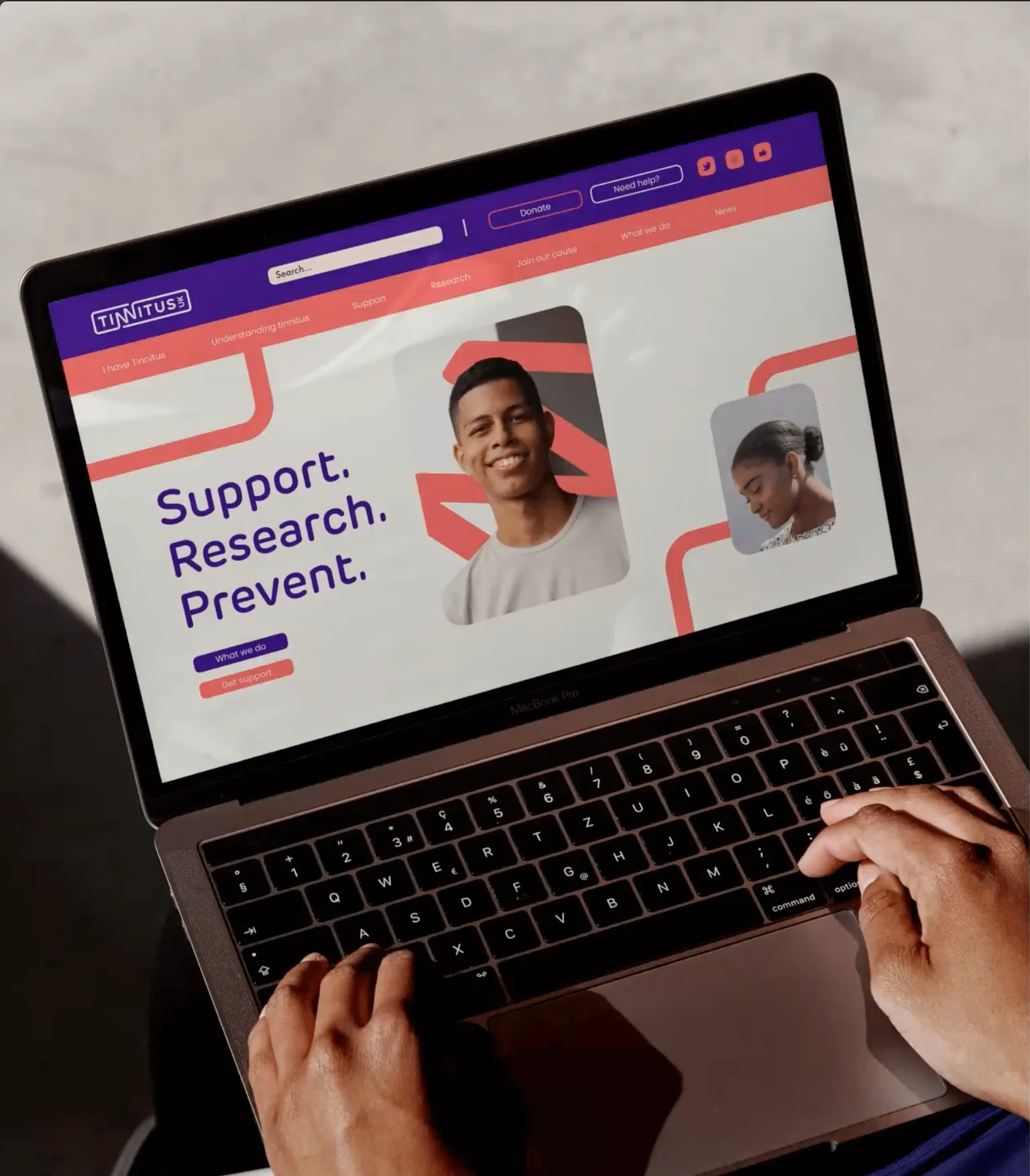
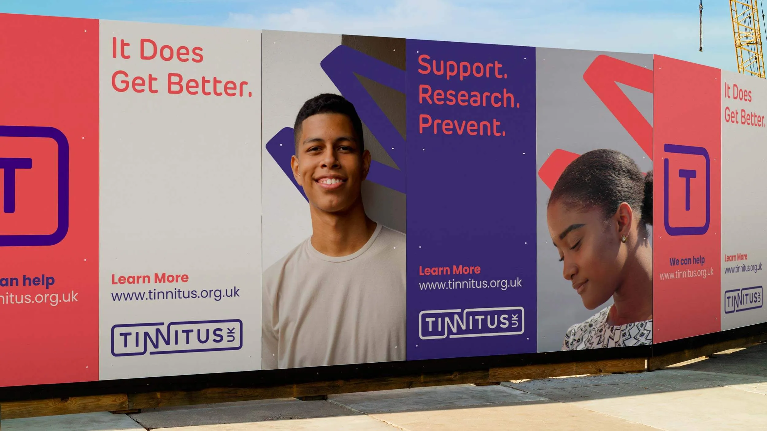
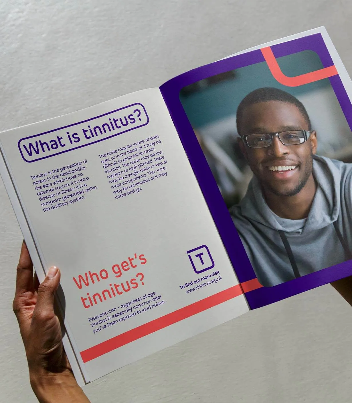

Transform Awards Europe 2023/Best Visual Identity, Charity - Silver: Tinnitus UK


What the client said
They have shown their value in helping us to navigate some of our key challenges as a brand. It also helps that they are fun to work with and always push us to think differently about our brand.
Head of Communications
UK health charity

We're a Ruder Finn Company
Stay connected

